PROCESSING PANTONE
THE INCENTIVE
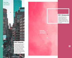
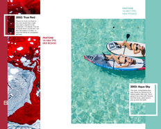
This book was designed to be a coffee-table book. Functioning similarly to a magazine, this book delves into the basics of Pantone colors, finishes, and the history of Pantone's Color of the Year since 2000.
sep - dec 2019

WHAT IS IT?
This book covers the essentials of Pantone color matching by type of graphic, fashion or furniture, and plastics. This book also features a foreword by Diana Budds on her initial insight into the "World of Pantone."
The Pantone Color of the Year choices featured in this book include: Cerulean, Fuchsia Rose, True Red, Aqua SkyTigerlily, Blue Turquoise, Sand Dollar, Chili Pepper, Blue Iris, Mimosa, Turquoise, Honeysuckle, Tangerine Tango, Emerald Green, Radiant Orchid, Marsala, Rose Quartz/Serenity, Greenery, Ultra Violet, and Living Coral.
%203.jpg)
.jpg)
THE DESIGN CHOICES
I chose to design this Pantone book because I wanted to challenge myself to work with visually stimulating imagery.
Because of the nature of the content, I had to strategically align the text, imagery, and color to the grid and maintain its structural integrity.
When laying out the grid, I wanted to account for all of the different design elements. This would ensure that the photographs would be proportional to each other and that the width of any decorative line segments would be the same as the rest.
Each page interacts with the white line segments, the colorful image, the tiny square color swatches, and the natural white space. This contrast creates a hierarchy of information processing.
The text is uniformly black in color and is fitted to each page, backed by an additional white plane to stand separate from the imagery.
ACCOMPLISHMENTS
I'm very proud of this book because the layout was entirely my own. While thinking about hierarchy, text, image, and color, I laid out grids and guides to set up a foundation for my imagery in a way that didn't seem too "chaotic." This book was incredibly challenging because there were so many clashing colors that didn't make sense to disclude when dealing with a book about colors. That's the reason I spent extra time taking the considerations to build a solid layout that was both consistent and interesting; that had space for text and image, and allowed viewers to pay special attention to the colors.
PRODUCT PHOTOS


